


Notice how the program has drawn the best fitting straight line through your data, and also plotted the equation of this straight line on the screen.
IMPORTANT NOTE: The chart title that has been used is an example of an "uninformative" graph title

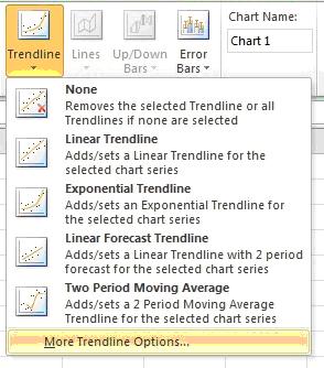
| 1. | Click on Layout tab under Chart Tools. | |
| 2. | Click on Trendline and then select More Trendline Options... | |
| 3. | Under Trendline Options, select Linear. | |
| 4. | At the bottom of the window, tick the box next to Display equation on chart, then click Close. | |
| Your spreadsheet should now look something like that shown opposite. Notice how the program has drawn the best fitting straight line through your data, and also plotted the equation of this straight line on the screen. IMPORTANT NOTE: The chart title that has been used is an example of an "uninformative" graph title | | |