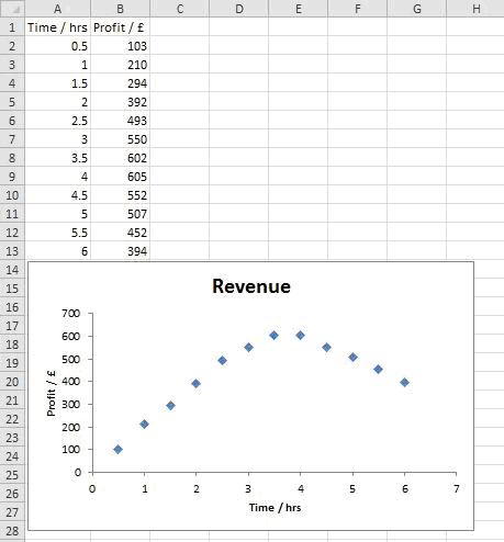
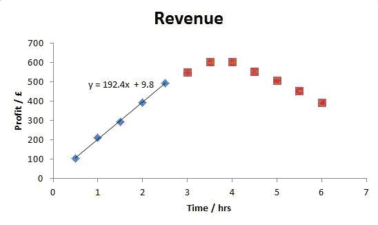
| ADD A TRENDLINE TO PART OF A GRAPH Enter the data opposite onto Sheet4 and generate a graph so that your worksheet looks like the one displayed. To only analyse and add a trendline to the initial rise in profit (i.e. the first 5 data points): |
 |
| 1. |
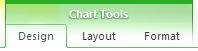
Click on the graph, then click the Design tab under Chart Tools. |
 |
| 2. |
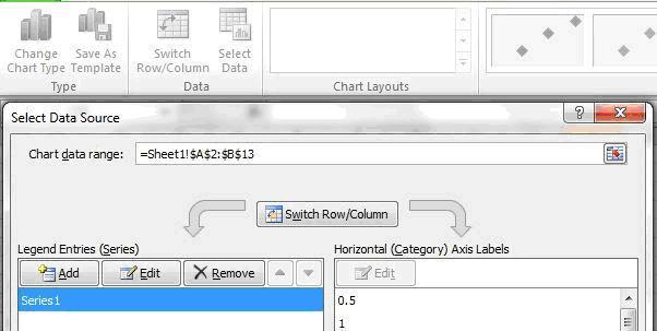
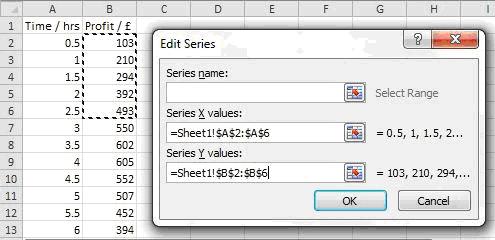
Click on the Select Data icon, then select Series 1 and then click Edit. |
 |
| 3. |
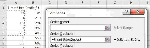
Click the box under Series X Values and then highlight cells containing the first 5 x-values (in this case A2 to A6). |
 |
| 4. |
Click the box under Series Y Values and then highlight cells containing the first 5 y-values (in this case B2 to B6). |
 |
| 5. |
Leave the box next to Series Name blank and click OK. |
| 6. |
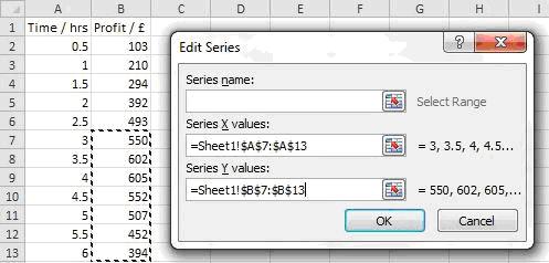
In the Select Data Source window click Add. |
|
| 7. |
Select the remaining Series X values and Series Y values (in this case A7-A13 and B7-B13 respectively). Leave the Series Name blank and click OK (twice). |
 |
| 8. |
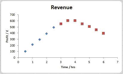
Your graph should now look like the figure opposite. Note that the two series that have been defined/plotted are shown with different marker types. |
 |
| 9. |
Click on one of the first 5 data points to select the data series and then click on the Layout tab under Chart Tools. |
 |
| 10. |
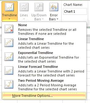
Click Trendline and select More Trendline Options from the bottom of the dropdown menu that appears. |
| 11. |
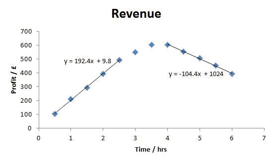
Select a suitable trendline (with equation) and then click Close. Your plot should now look like the one shown opposite. |
 |
| |
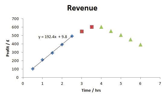
| ADD MULTIPLE TRENDLINES If you also wanted to analyse the decrease in the profit at the end of the day (i.e the last 5 data points) and add a second trendline to the graph, the same process is used: |
| 12. |
Using the Select Data icon, create a new data set for the last 5 data points, and adjust Series 2 to just include the remaining data points (in this case A7-A8 and B7-B8). This should give a graph that looks like the figure opposite. |
 |
| 13. |
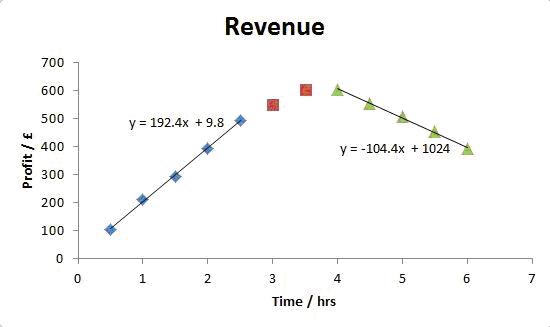
Select one of the last 5 data points, and create a trendline for them. |
 |
| |
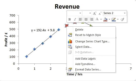
| Assuming you want to change the markers on the graph so that the data appears as one, not three, series: |
| 14. |
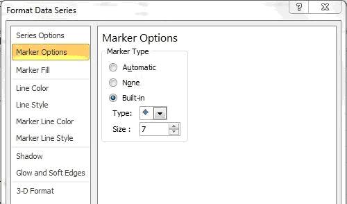
Right click on one of the markers (that you wish to change) and select Format Data Series. |
 |
| 15. |
Then adjust their appearance under Marker Options, Marker Fill and Marker Line Colour, so that the desired appearance is achieved, i.e. so they look the same as the series you want all the data to appear like. |
 |
| 16. |
Repeat for all the data series until all the markers are changed as desired. The final plot should then look similar to the one opposite. |
 |