
In some ways a preferred alternative to using regression to find errors in the gradient and intercept is to add max/min lines to a graph, since this determines the error in the gradient and intercept based on the measurement errors made during the data collection rather than just relying on the statistical distribution of the data.
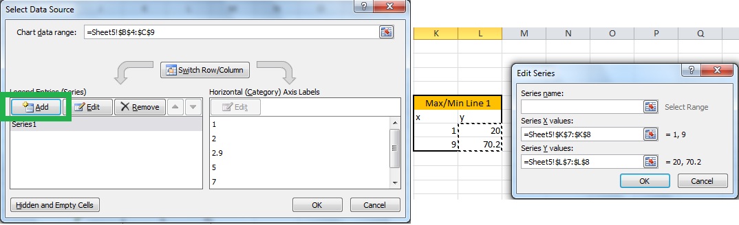
Although there is no tool to create max/min lines in Excel, it is still possible to add them by plotting additional data based using the graph error bars/values.
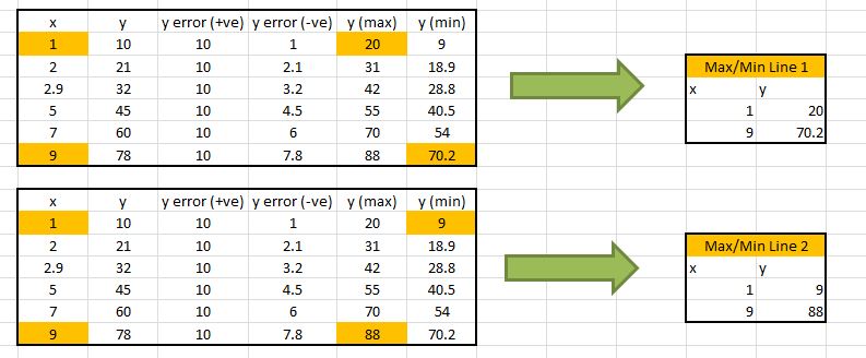
The data (and plot generated from it) for the example used to illustrate this procedure are given below.
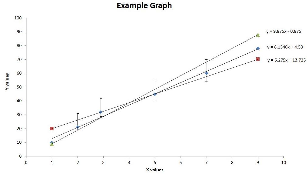
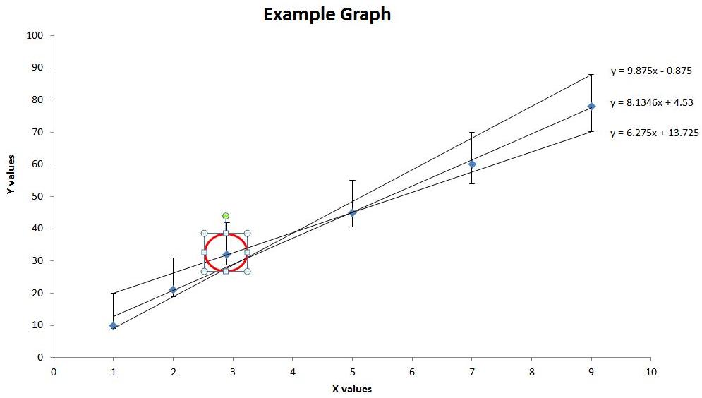
IMPORTANTFOR THE ADDED MIN/MAX LINES TO BE VALID THEY MUST PASS BETWEEN ALL THE ERROR BARS.(NOTE THE PROBLEM POINT CIRCLED ON THE PLOT ABOVE) |
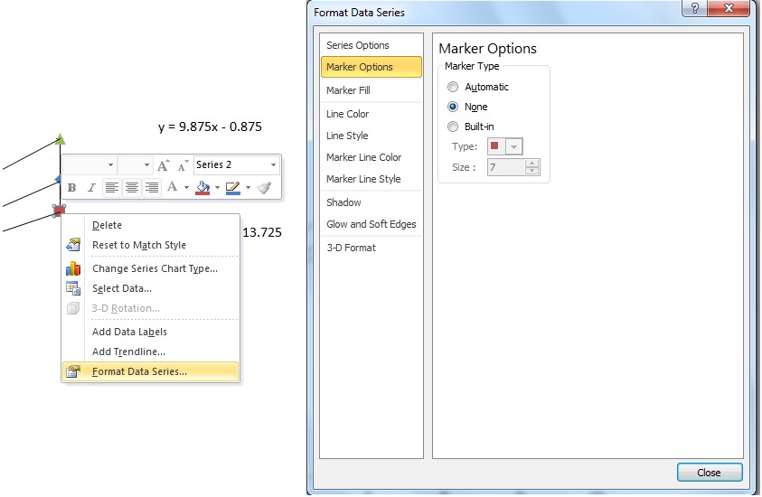
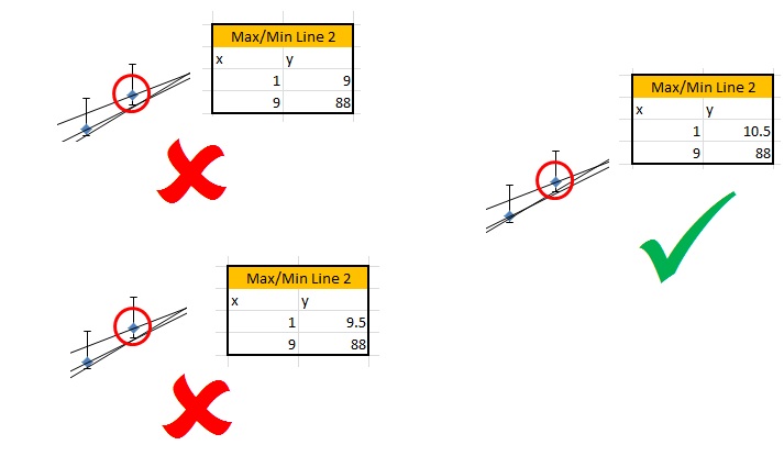
If your Min/Max lines do not pass between all the error bars: Go back to the data you selected for the line and adjust the y values until the line passes between all the error bars - the line will adjust automatically as you change the values in Excel:
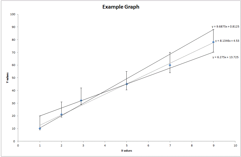
The final graph for the example given (with valid Min/Max lines) should look like the below.
| ADDITIONAL NOTE: If x and y error bars are shown on the data, then you should assume that for each data point these error bars describe a box. In this case the Min/Max lines must pass through or touch every box to be valid. |  |