Using Excel 2010 - Add Non-Linear Error Bars to a Graph
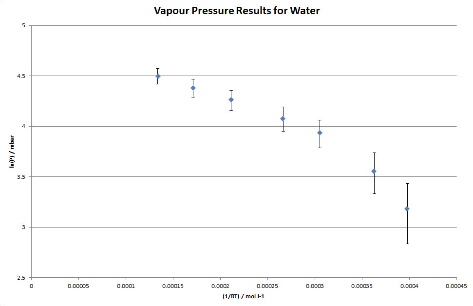
Sometimes the errors on a graph are not the same for every point. For example, if the pressure data from the example in the Manipulating Data section of this tutorial were assumed to have an error of ± 7 mbar, then the associated errors in a ln(P) vs 1/RT plot would not be the same size for every point (since a logarithm is a non-linear function).
The non-linear errors may be added to your plot in the following manner:
- Add additional column titles to data entered/calculated on Sheet3 (in the Manipulating Data section of this tutorial) as shown below.
Note: To add the + Error and - Error titles you will need to enter in the cells '+ Error and '- Error. The ' tells Excel to display the entry as text... without this, given that the entry would then start with a + or -, Excel would attempt to treat the entry as a formula (and for this example the result would be the generation of an error message in the cells).
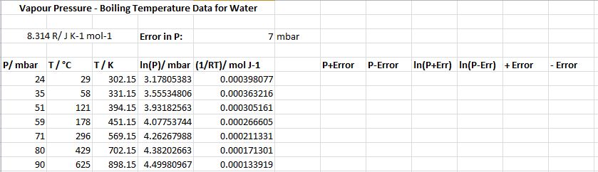
- In columns G and H we will calculate values of the pressure plus its error and the pressure minus its error, i.e. the maximum and minimum possible pressures:
Select cell G6, type in =A6+E$3 and then press Enter.
Select cell H6, type in =A6-E$3 and then press Enter.
- In columns I and J we will will calculate the corresponding maximum and minimum values of ln(P):
Select cell I6, type in =ln(g6) and then press Enter.
Select cell J6, type in =ln(h6) and then press Enter.
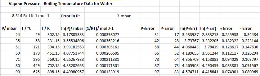
- In columns K and L we will calculate the positive and negative errors in ln(P), i.e. Positive Error in ln(P) = ln(P+Err)-ln(P) and Negative Error in ln(P) = ln(P)-ln(P-Err). This is done by entering the formulas =i6-d6 and =d6-j6 in cells K6 and L6.
- Block copy the new cells, so that data down to row 12 is generated, as shown below.
- Plot a graph of ln(P) versus 1/RT and rescale it appropriately.
- Go to the More Error Bars Options... as detailed in the Add Error Bars to a Graph section of this tutorial.
- Select Custom error bars and click on Specify Value.
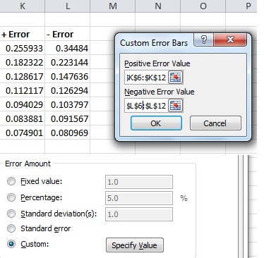
- For the Positive Error: Click in the white box and then highlight cells K6 to K12.
- For the Negative Error: Click in the white box and then highlight cells L6 to L12.
- Click on OK. The graph will now include the non-linear error bars, as shown below. Note: This plot includes an "informative" graph title.